Why do some modern homes feel cold?
Modern design relies on clean lines and few details, so colour and material carry the whole personality. When the choice is limited to cool greys, bright white and glossy surfaces, the space feels like an office or a showroom. The cure is not loud colour; it is warm neutrals, wood and varied texture.
Start by fixing just three elements: a main neutral for walls and large pieces, a main wood, and a dark contrast colour for outlines, such as black or deep brown. Everything else builds on these three, and it helps to write them down and put their samples together before buying a single piece.
Warm neutrals: off-white and greige
- Warm off-white: a replacement for stark white, with a hint of yellow or beige, easier on the eye in strong sun.
- Greige: a blend of grey and beige and the most flexible modern colour, working with light and dark wood and with marble.
- Light warm grey: good for sofas and rugs, and more forgiving in daily use than white.
- Clay and sand: add clear warmth while staying calm, suited to family living rooms and bedrooms.
Test each shade against the floor: a greenish greige can clash with yellowish beige marble, so pick the shade that shares the floor's undertone.
Warm wood: half the palette
In a modern room wood is not just a material but a main colour.
- Light oak and honey tones: feel airy and bright and suit smaller spaces.
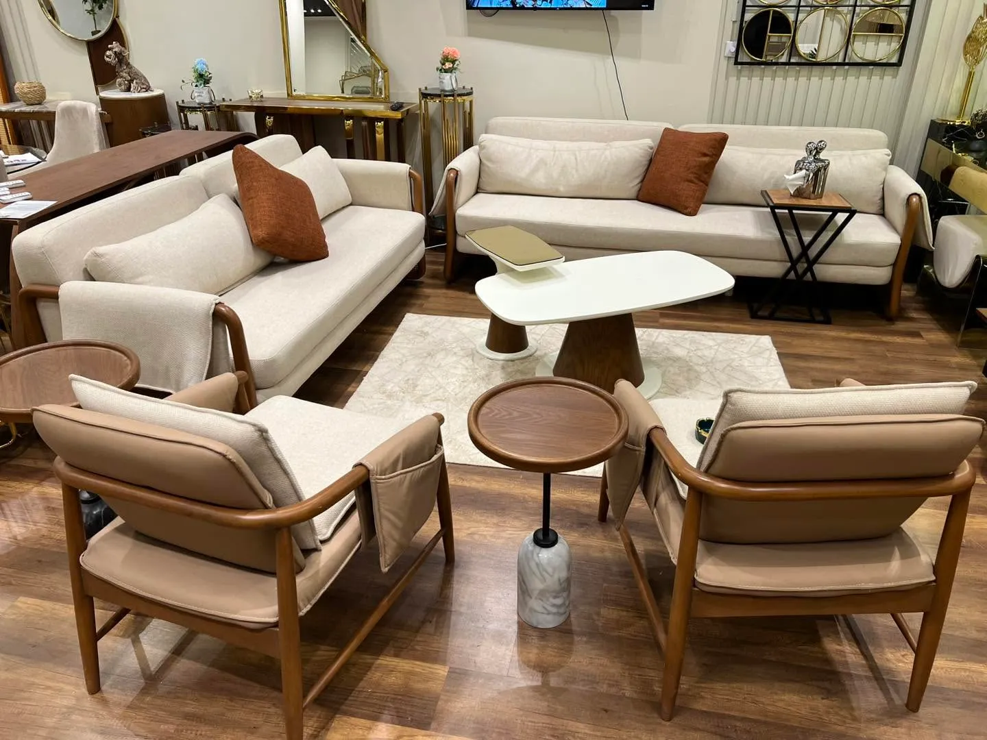
- Walnut and mid browns: warmer and richer, excellent with greige and black.
- Use one or two woods per space and repeat them across doors, cabinets and tables.
- A matt or satin finish shows the grain and looks more current than gloss.
Black in measure: a frame, not a backdrop
Black gives modern rooms definition, but it works as an outline that draws lines rather than a colour that covers areas.
- Table and chair legs, cabinet handles, mirror and picture frames.
- Pendant lights or lamps with black metal bodies.
- A thin line on a shelf or bookcase division.
- Avoid a large black sofa in a dim room; it swallows space and shows dust clearly.
A practical rule: repeat black at least three times in the room in small, spaced-out elements so it looks intentional rather than random.
Texture instead of more colour
With a restricted palette, texture becomes the source of richness.
- Bouclé or slubby linen on the sofa.
- A wool rug with a raised or hand-woven texture.
- Strongly grained wood beside matt stone or marble.
- Sheer or light linen curtains that soften the light.
- Handmade ceramics in the accessories.
A room with only three colours and five different textures looks richer than one with six colours that are all smooth.
Where colour fits in a modern scheme
If you want colour, take it from nature in a muted shade: olive green, blue-grey, terracotta or a soft mustard. Use it on a single armchair, cushions, one wall or an artwork. Keep very bright shades off large pieces; they tire quickly and are hard to change.
- A calm living room: off-white + light oak + thin black lines + a touch of olive.
- A warm bedroom: sand + walnut + clay linen + a touch of terracotta.
- A deeper home study: greige + walnut + blue-grey + black.
Common modern colour mistakes
- Cool grey on everything, leaving the home without warmth.
- Mixing four or five different woods in one room.
- Gloss everywhere, reflecting light and showing fingerprints.
- Stark white walls with cool lighting, which feels clinical.
- No contrast: sofa, wall and rug in the same shade with no step between them.
- A stark white sofa in a home with children, when greige or light sand gives the same look with less upkeep.
- Too many metals: keep to black plus one warm metal such as brass or bronze.
From palette to finished piece
Clean modern lines expose any error in size or wood tone, so every choice deserves to be seen in reality. Arti Design builds modern furniture with clean lines to the size of your space, with wood, fabric colour and finish approved with samples before production.