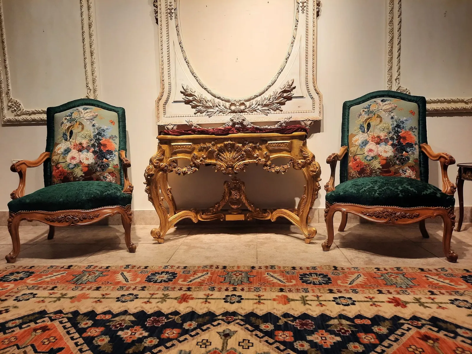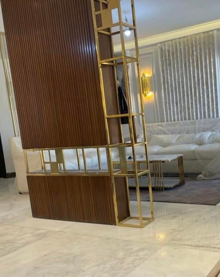
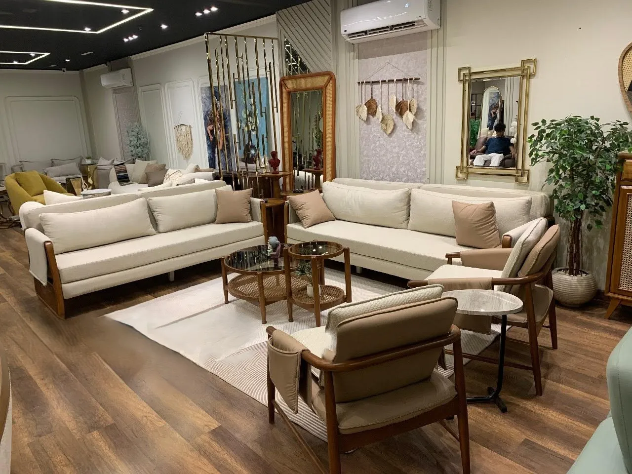
Start from what is fixed, not from a paint chart
The most common mistake is picking a wall colour first and then hunting for furniture to match it. Work the other way: begin with what is hard to change, such as marble, porcelain or parquet floors, doors, the staircase and the kitchen, then the large pieces like sofas, the dining table and rugs. Those stay for years; paint can be redone in two days.
- Collect a small sample or a clear photo of every fixed element.
- Decide whether they lean warm (yellow, beige, honey wood) or cool (grey, bright white, bluish marble).
- Keep the whole palette on that side, adding a single colour from the other side purely for balance.
The 60-30-10 rule in real rooms
The rule splits a room into three shares: 60% dominant colour, 30% secondary and 10% accent. It is not exact arithmetic; it simply stops the eye from jumping around.
- Dominant (60%): walls, most of the floor and the large rug. Usually calm.
- Secondary (30%): the main sofa, curtains, TV units or large wooden pieces.
- Accent (10%): cushions, vases, frames, a single armchair, or touches of gold and brass.
In a large majlis you may split the 30% between two close shades of the same family, but avoid adding a fourth colour that competes with the accent.
A worked example for a family living room with beige marble: warm ivory walls and a light sand rug form the base, a clay-coloured sofa with linen curtains in a close shade forms the secondary layer, and olive cushions, accessories and copper touches form the accent. To change the mood later, you only need to rethink the 10% without touching the large pieces, which is the cheapest way to refresh a room every few years.
Light and orientation change every colour
The same paint looks different from room to room depending on how much natural light enters and from where. In Saudi Arabia and the Gulf:
- North-facing rooms get soft, slightly cool light that makes greys look flat. Choose warm shades such as creamy beige and ivory.
- South- and west-facing rooms take strong warm sun, so they handle slightly cooler neutrals; yellowish shades can turn harsh in the afternoon.
- East-facing rooms are bright in the morning and calmer in the evening, so check the colour at both times.
- Internal rooms without windows rely entirely on artificial light, so pick the colour after deciding the colour temperature of the lighting.
Link the rooms without making them identical
A coherent home does not mean every room is the same colour; it means the eye moves from space to space without a jolt. This matters most in open plans where the living room, dining area and entrance are seen in one view.
- Fix one shared neutral for corridors, entrances and ceilings.
- Let the secondary colour of one room appear as the accent in the next.
- Repeat one or two wood tones or metal finishes throughout the house.
- A formal majlis can take a richer character as long as it is tied to the rest of the house through wall or curtain colour.
- Bedrooms are fairly independent and can take their own calmer palette.
Test samples in daylight before you commit
Do not rely on a phone screen or a small chip under showroom lighting.
- Paint a sample of at least 50 × 50 cm on two different walls of the same room, or use a painted board you can move.
- Look at it in the morning, at midday and after sunset under the actual lighting.
- Place fabric, wood and marble samples next to it; harmony is judged together.
- Choose a shade slightly lighter than the one you liked on the card, because colour deepens over a large area.
Mistakes that lead to repainting
- A cold bright white with warm beige floors, which makes the marble look dirty.
- Repeating the accent colour in every room until it stops standing out.
- Painting every wall of a small, dim room in a dark colour.
- Buying curtains and sofas before the wall and floor colours are settled.
- Ignoring the ceiling: a cold white ceiling over warm walls draws a hard line.
- Using flat matt paint in kitchens and bathrooms, where a wipeable finish is the better choice.
- Judging a colour from a photo online, where the lighting and camera differ from your home.
Match colours with furniture before production
The best time to settle the palette is before the furniture is made, so fabric, wood tone and finish can serve the plan instead of chasing it. At Arti Design, size, wood, fabric, colour and finish are approved with samples before production, so you can hold them against your own walls and floors in your home's light.